The Armed Forces Covenant Fund Trust – Sub-Logo
New Sub-Logo Addition to Brand
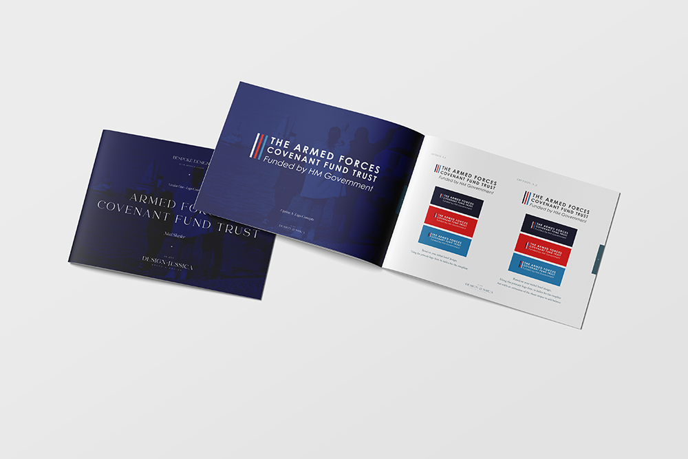
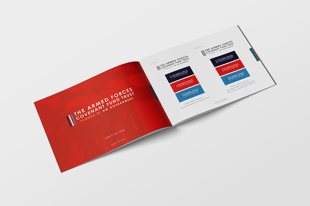
I'm thrilled to share my recent work creating a sub-logo for the Armed Forces Covenant Fund Trust. The trust, dedicated to supporting the armed forces community, needed a new sub-logo to complement the branding we created together in 2015.
Their commitment to empowering and enhancing the lives of the armed forces community served as the guiding light for the original design concepts. That, coupled with this new, 'extended' logo, would give the Trust a complete brand that could be used across all digital and printed literature.
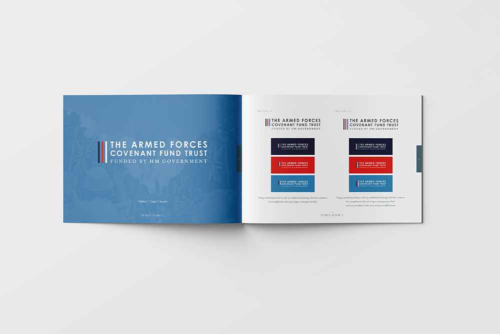
Colours hold immense power in conveying emotions and sentiments, which is why the initial tri-service colours are included in the design. For the sub-logo, we needed to pick a colour that would remain neutral but also echo the trust's values and heritage.
Selecting the right typography was crucial in maintaining a good balance between professionalism and approachability. Clean and modern fonts were chosen to ensure readability and a contemporary feel. The typography complements the visual elements, enhancing the overall impact of the sub-logo.
The sub-logo now seamlessly integrates with the existing Armed Forces Covenant Fund Trust branding on their website, https://covenantfund.org.uk. The goal was to create a cohesive visual identity that reinforces the trust's mission and values while allowing the sub-logo to stand alone when used, for example, with individual projects' branded literature.
