As business owners, we often find ourselves living the “multi-hyphen life”. As you know, I am a designer by ‘trade’, but I’m also a social media manager-copywriter-project manager-tea maker – oh, and I also host a podcast series. When you’re just starting out, you’re unlikely to have an unlimited budget for outsourcing your business administration, so you have to save money and do it yourself. However, there are some areas where you shouldn’t cut corners – one of those areas is brand design.
When you hire a professionally qualified designer, not only are you buying your final product (in this case your branding); you’re also buying all those years of training, and experience. You’re investing in a product polished through years of expert training. Often, business owners are put-off by the cost of hiring a designer and try to do it themselves. But when it comes to visual branding, cheaper definitely isn’t better – if you think good design is expensive then you’ll wince at the price of bad design!
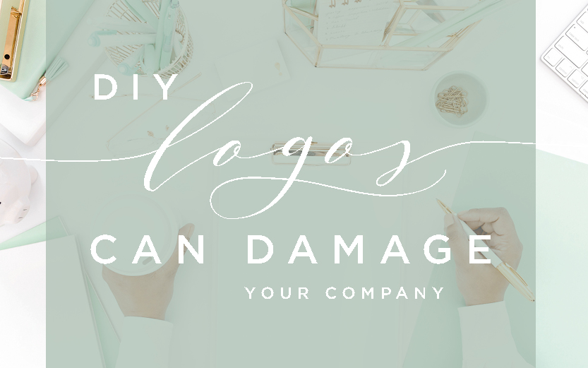
So Why Shouldn’t You Do-It-Yourself?
It may a cliché, but first impressions last. Your brand (and especially your logo) gives your prospective clients that initial feel of your company and lets them know what they can expect from you. You’ll be putting it on everything to do with your business so it needs to be the best it can be. Here are some of the common problems with DIY and cheap logos:
They look unprofessional
Like all visual products, if your brand is done on the cheap, quite frankly everyone will notice. You want your business to look professional, not just to help attract customers but more importantly so you don’t drive prospective clients off. If your branding looks unprofessional, the first instinct will be that what you’re offering is unprofessional too. People really do judge a book by its cover.
They are overly complicated
The word ‘brand’ literally comes cattle branding. It’s a farmer’s way of saying ‘look at me and my quality livestock!’…or something like that. It’s a simple and clear way of defining the ownership of that quality product. Your branding should be the same. Your customers should be able to look at your logo and instantly recognise your company, no matter how large or small it is. If it’s too complicated it’ll lose detail, and they’ll get confused. A designer’s strength lies in what to add, but equally with what to take away.
They use system fonts
There are literally millions of fonts and typefaces in the world. They can be serif, sans serif, script, handwritten, italic, title cased…. how will you know which to pick?
A designer knows how to pick the right font for your brand that not only matches your company perfectly but also compliments the other fonts in your company’s brand. They aren’t limited by what happens to be on their computer because designers have a whole collection of typefaces to choose from – all of which they’re licensed to use.
Like all artistic works fonts are owned by their creators, and you’ll need permission from them to use it. Your designer will be able to advise you on how to use these and what to do commercially with these fonts. They should also be giving you the names of these fonts so that you can use them within your future branding to keep a consistent look.
They misuse colour
The most important part of any brand is consistency. If you consistently apply the same style to all parts of your business you’ll be quickly recognised by your clients and customers. Brand recognition = more sales. The easiest way to do this is through colour.
There are so many successful companies that use colour consistently. When you think of chocolate you automatically think of purple, when you think of a posh New York jeweller you’ll instantly think of Tiffany’s Blue. It’s the same with Sainsburys – just look at their carrier bags, or Selfridges – I just love that yellow.
So, let’s talk about Cadbury’s and that purple. Cadbury use the exact same purple colour in all of its marketing, branding and packaging – but how do they know it’s the same colour? Every colour has a unique reference called a Pantone code. Pantone is an internationally recognised way of grading colours so that any printer in the world can print in that exact same colour – as long as they have the code. This code is translated by designers into a digital code for websites and social media. It’s not guess work, it’s an exact science – consistency is key!
If you’ve created your own logo you’ll probably not have considered how you’ll find out what these codes are, and you’ll really struggle when your new web designer asks for a hex code or your printer wants a Pantone reference. It’s a designer’s job to be giving you all of these breakdowns as part of your brand because – and repeat after me…. consistency is key!
They’re limited in what you can do with them
If you’ve created your own logo without using design software then the reality is that you’re limited in how you can use it. All logos should be created as vectors and are normally created in industry standard design software, such as Adobe Illustrator or InDesign. A vector is a universal way of creating a design that can be used for anything. If you’ve purchased a branding package these are usually in the form of .eps, .pdf or .ai files and your designer should have explained how to use these files.
Vectors can be resized for large print projects. For example if you wanted to pop your logo on a hot-air balloon you’ll easily be able to do that using a vector. You’d struggle if you’ve only got a .jpg.
Ok, so you want a vector logo – you can get those premade online.
They’re not uniquely yours
Imagine heading to a networking event and finding someone who does exactly the same thing as you AND they have the exact same logo! I’ve seen it happen- cringe!
Even worse, imagine building a brand and a great following using a premade logo only to find that someone in the local area is trading with the same logo after doing none of the hard work. This is what happens when you invest in pre-made logos from online companies. There’s no option to retire that logo so there’s a real threat that someone else could buy it, or may already have it. Your company is special and unique, you want to stand out from the crowd. Don’t let it down by looking just like someone else.
Your company’s branding is so important. From initial first contact through to sales and customer relations, it should be on everything you do. So make sure it’s special! It should be bespoke and a one-off, just like your company. By investing in a good designer, you can have a complete brand foundation that’s easy to use, understand and will last for years. You’ll have a professional looking, commercially sound, multi-use logo with fonts and colours to back it all up when you expand it use to other marketing. Limiting your branding because of cost ultimately limits your company’s potential.
If you’d like help with your new branding or your existing brand isn’t quite as unique as it could be then I’d love to help – you can book a free consultation with me here and together we can make sure your company stands out from the crowd. I only create 10 of the No.1 Bespoke Branding Packages each year so I can focus completely on your project – book one today!


Leave A Comment