Build Your Brand & Attract Your Dream Clients – time to say ‘goodbye’ to boring logos and ‘hello’ to beautiful inspirational branding.
Welcome back to the Build Your brand & Attract Your Dream Clients series, where we say ‘goodbye’ to boring logos and ‘hello’ to beautiful inspirational branding. Throughout the series we will explore what branding is, and throughout the coming posts I will aim to show you how great branding can attract your dream clients, how companies build strong brands, and how you can do it too.
I hope you enjoyed the first and second blog posts where we talked about what branding actually is and how to design a new logo. If you haven’t read blog one and two I recommend you go back and check those out.
If you have read the introduction blogs how did you get on with your mood boards and your new logos? Are you inspired? I’d love to see some of them so please comment below or post your photos on my Facebook page.
So, today we are talking about colour theory and how to pick the perfect colours to communicate your brand values. Colour is a crucial element of your branding and eventual style guide, and can be used alone in your text and logo but can also feature in your patterns, icons and photography.
Colours have unexpected emotional connection to you and your clients. I am going to talk through some colours below, and what they have meant historically in branding and design.

Red is a strong and defiant colour. Its bold and isn’t afraid to stand out in the crowd. Think of brands like Virgin and Coca-Cola. They have a bold impact when red is used in its brightest form, but can also add traditional and a vintage feel if you use darker versions such as like oxblood.
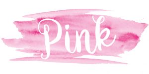
Pink is romantic and in its brightest form shows energy and optimism. It can be quirky, fun and can show confidence in brands, like Victoria’s Secret and HMV, but in its lighter versions can show a feminine side and added class.
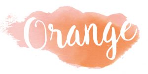
Orange isn’t the most popular colour and sometimes can evoke a feeling of ‘cost-saving’ (think of Easy Jet and B&Q). However, like red it’s a strong colour and used by creatives to add energy and a positive feel. It can also be used in its pastel form. Coral is a beautiful colour, and very on-trend at the moment.
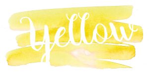
Yellow exudes confidence and positive energy and is the happiest of all the colours especially when used in its brightest versions. It’s also a great statement colour, think of Selfridges. However, it’s a hard colour to use for text, especially on white, as it’s not very legible and in its pastel form, in sherbet, it can get a bit lost so bare this in mind if you’re going for lighter versions.

Green is like the spring. It shows abundance and a link to nature. In its brightest forms it suggests lush growth and a darker green can add a bit of heritage to your brand. Jaguar Landover have mastered this in their branding using British Racing Green effectively.

Teal is my own favourite. Its creative, fresh and innovative and I have used it for my own Design Jessica branding. In its brightest version it shows intensity and efficiency and in a pastel form it’s calming and fresh.

Blues are traditionally used for banks and legal firms and show efficiency and communication. Think of companies like PayPal and Facebook. They want to give off a strong look to their clients, to show planning and structure. Softer hues can give off a feeling of calm and relaxing and are often used in design for spas.
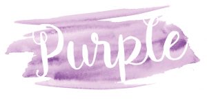
Purple gives off a feel of glamour and luxury especially if used with metallics and black. Cadbury has used this very successfully in their branding. In its brightest form it gives off a feel of strength and vision but can feel quite relaxing in light violet versions.
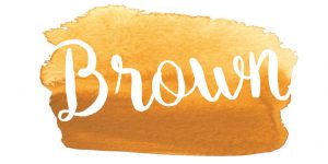
Brown shows reliability with its vintage feel and evokes feelings of an organized company, much like blue. UPS is a great example of this. In its darker forms its very traditional but can add an organic feel if it’s used in a light version.

Black, like purple, can give off a glamourous and sophisticated feel if used correctly. It can also show power if used in a different way, like with Nike and Puma. However too much black can sometimes be overpowering, so the use of grey can be a different way of using the colour.
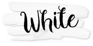
White can show purity and clarity and although it probably won’t be your primary colour it can be added as accents or as ‘white space’ within a holding device. Apple has got this use spot on. Equally, mixed with a tiny bit of colour, pastels can be used to create something beautiful, but they can sometimes get a little lost in a brand if not used with one strong colour.

I love to use metallics, especially rose gold which is very popular at the moment. It gives off a feel of quality and glamour. You need to keep in mind that you can’t print metallics in traditional CMYK production, so it should ideally be kept as an accent addition to your brand colour stack.
Your actionable for this week is to produce your brand colour pallet. Don’t worry, it isn’t as difficult as it seems. Using your dream board pick out the colours that you love most and the ones that are really appealing to you and then collate them, either in an illustrator file or on your moodboard. You can source them from a pantone book if you have one but paint charts work really well. I also find some lovely colour combinations from Pinterest.
You want to focus on the colours you love, but also keep in mind that they need to be practical. You’ll need to have at least one darker colour that you’ll be using for your text on your printed marketing material and in your website.
You then need to arrange them into primary colours (the ones that you’ll use most) and secondary colours (the accents ones that add to your brand), and remember they’re going to be used on all parts of your business branding.
Next time we will talk about typography and how to pick the right typeface for your new brand.
I hope you’ve enjoyed this third blog and found it useful. If so I’d love it if you’d like it or share it with someone else who might find it helpful.
If you have any questions about branding, post them below and I will be happy to answer them.
So, I will see you next time for more about building your brand and attracting your dream clients.


Leave A Comment